The Anatomy of a Restaurant Website
Much like the architectural or interior design of your establishment, your website serves as a digital first impression for all of your customers. The features, layout, and organization all affect how your site draws diners through the front door.
When people go out to eat, they all have three things on their mind: the food, the ambiance and a relaxing atmosphere they can enjoy with friends. Your website needs to incorporate these three aspects in its overall design to help make the website experience as welcoming and inviting as your physical location.
Examine our brief guide to the ideal anatomy of a restaurant website to help you make your establishment’s digital experience both attractive and memorable.
Skip Flash Animation
It’s 2017. That means flash-based sites are dead. They have been so overdone that they only create frustration in most restaurant website users. Adobe Flash clutters the interface and loads far too slowly. Focus on ease of access to necessary content, such as hours, menu, contact, reservations and online ordering.
Build your site using CSS3 or HTML5 for improved functionality and faster load times. Most coders use HTML5 as the basic structure of websites. Your images and design will be all the “flash” you need.
Autosound
Don’t do it. Nobody likes listening to canned muzak while browsing a site, especially if it slows down the loading the site. If a site doesn’t load in two seconds, customers go elsewhere. Considering that most people access websites from mobile devices, no one wants to have to hastily shut off their medial audio volume while riding public transportation or sitting in an office or waiting room.
Reservations
Make your Reservations section brief, easily identifiable and crystal clear. If possible, integrate online booking via an app or within the site itself. Do not write 48 lines of text about how to book a reservation with your contact information listed at the bottom in teensy-tiny font. Call-in reservation establishments should make that number large and easy to read, and any instructions about reservations should be kept to a bare minimum.
Content
This one is huge. Keep updating your site with fresh content beyond menu updates, changing hours, or upcoming promotional events. Well-written copy is a good option to consider, but better still is a blog that updates at least weekly with information.

Design content to engage your customers. Write about the history of the dishes you serve, trends in the industry, how you source your ingredients, meet the staff and your newest seasonal dishes. As long as it is error-free, interesting and gives users a reason to visit the site every week, you are headed in the right direction.
If you are not confident in your blogging skills, there are numerous agencies available who will keep your content updated and exciting every week. Don’t forget about video content. Post tours of your place, a 30-second spot or a behind-the-scenes video of a typical evening at your restaurant.
Details, Details
Spend most of your time designing your website while creating the most appealing user experience possible. Proof and reproof all of your content for typos. Refine your labels and sections. Play with different layouts to make your most important content the easiest to access. Access the site from multiple browsers and mobile web browsers to see how it functions across multiple platforms. The more you pay attention to detail, the better you can create a dynamic user experience.
The Landing Page
Do not, for the love of all that is good and holy, use a “click here to enter” button to greet visitors to your site. If your site includes this feature, you have already failed at creating a positive customer experience. The very first page your potential customers should see is your main landing page. No one wants to wait around for your site to load after staring at a fancy-but-useless welcome screen.
Imagery
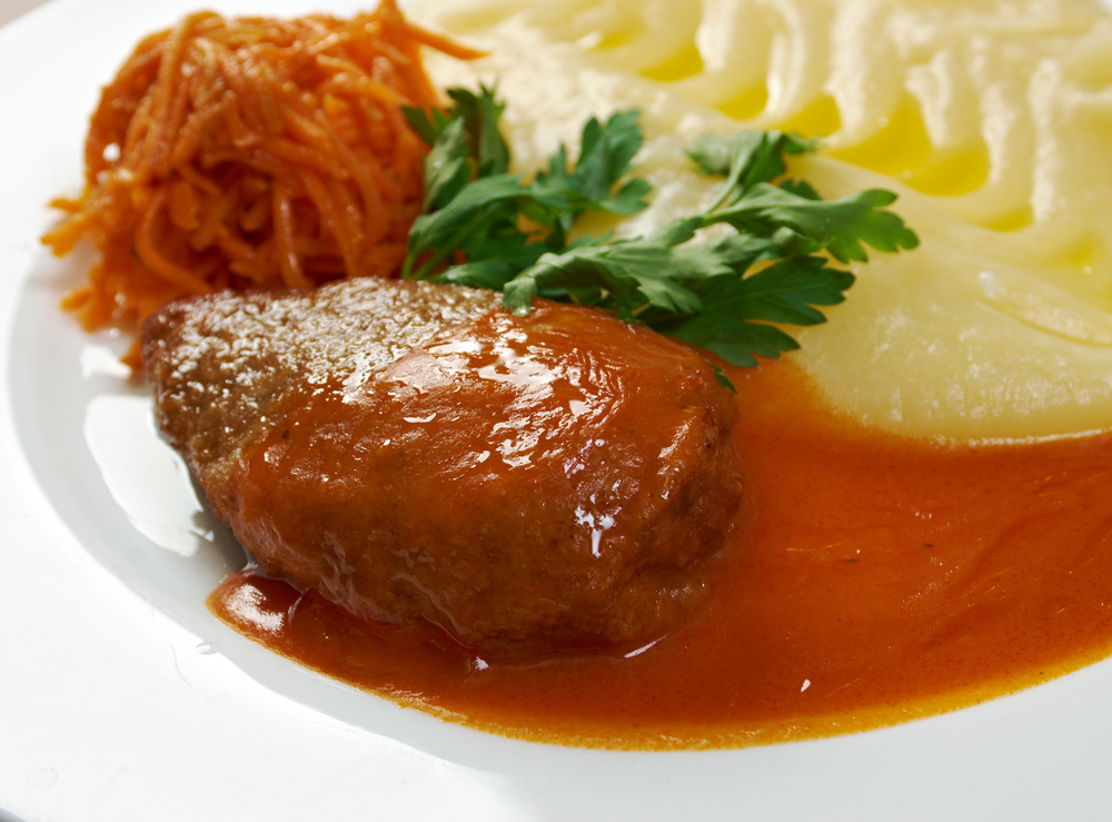
Nothing makes or breaks your website like high-quality, professional photography. Think of three words: spend the money.  In the long term, investing in professional-quality photos, images and logos from a graphic designer pays for itself. Images are the foundation of every good website, and if yours aren’t up to par, you set yourself up for failure in the long run.
Online Ordering
This is a must-have feature for all restaurants. Whether customers dining in or get some take out, they want to order right from the menu on the site using their smartphone or mobile device. A reliable, easy-to-use online ordering system saves you and your customers time and hassles, especially if you integrate it with a mobile app customized for your restaurant.
Best of all, online customers typically order $4 more than customers who order by phone or at the counter. Online ordering creates more opportunities to drive revenue and improve the overall customer experience.
All in all, as well-designed restaurant website depends on re-creating the feel of your establishment in the digital realm. The anatomy of that site should include instant access to the most important information and minimal text that gets right to the point. You website does not depend on flashy animation or audio features that drive customers to seek information, and often their meals, elsewhere.
Creating a functional and attractive website for your restaurant is key to long term success, so be sure to connect with an experienced web designer who can make sure you always put your best foot forward online. Let Orders2.me help you integrate online ordering into your high-quality restaurant website.
